
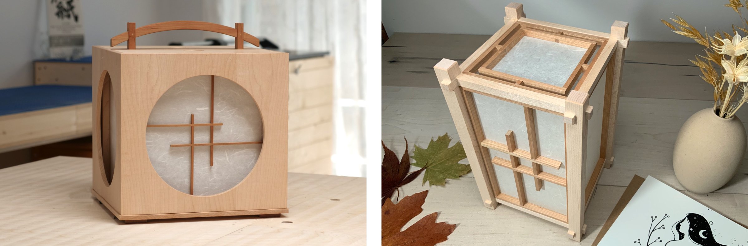
Grid options for the ‘Serenity Within’ collection.
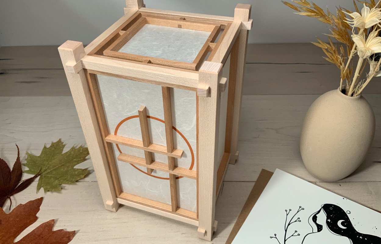
‘Serenity Within’ Collection - with circle
At this time of writing this blog post, there are two styles of grid patterns for this collection. More will come, but in the meantime I’d like to show you how to create different looks without affecting the positioning of the interlocking points. This way I can accommodate them easily enough.
There is a more classic grid, for those who prefer something along those lines, seen below on the right, and then something less conventional that called to me - this is the version with the circle, seen on the immediate right. The more classic grid actually lends itself better to being changed up, likely because it is centered and symmetrical.
First though, I’d like to share a little background on the design that called the most to me - the circle version and how it came to be.
From sometime now, I have been very drawn to round windows in general. I’ve found dozens of amazing pictures going back hundreds of years that I wish I could share here, instead, if you’d like to take a look, I’ll set you off on a good starting point with this Pinterest link So inspiring!
Try searching for “round Japanese shoji windows” next. It won’t be long before you begin to realize the source of my inspirations and how this helped guide me along the path of coming up with a meaningful name for this lantern/lamp collection.
The round Japanese shoji windows, when used in a very natural setting, such as a window into nature, just bring something so magical and peaceful to any scene or setting, a calmness, a serenity. My very first lantern, a keepsake of mine (shown below), echos this underlying theme too. The circle becomes a window into something beautiful… looking within.
While simple to look at, it took much experimenting to come up with a way that I feel is able to capture the essence of what I wanted to share with viewer. The circle is silk screened onto the Japanese washi paper with an acrylic paint (water based). The paint helps block as much light as possible while using a thin paper - this is necessary so that the circle blends in as close as possible with the wood grid in the foreground, once illuminated. BTW, if you would like a different circle colour, know it is possible.
My personal lantern keepsake (read more in the About page) | ‘Serenity Within’ collection - without circle

On the left, the base grid pattern, on the right the result of what we’re exploring.
Alright, onward with how to be creative within the constraints of what is currently available grid pattern wise. Let’s start with the classic more simple grid and what’s possible by simply “trimming” an existing part. The first grid on the right is our base, the others are variations…
Even though these look different, the places where each part interlocks is unchanged, with repects to the “anchor” point, which is the outer frame - this is the key. Changes like this can be accomodated if you have chosen to purchase this lamp, so you have some options to entertain beyond what may initially have seemed limited.
Yes, it is also possible to extend sections, as long as they do not intersect with anything or become too unsupported potentially cutting into the paper screen. I show one example of this too - see below.
With this technique/approach, you can begin to see possibilities for the circle version too. The current design works well, I spent much time on it, but based on the above approach you may have some more options, if the circle version is your preference.

On the left two more options, the latter showing an extended section. | On the right, we see how the sides and back are decorated.
I have grown fond of a “focal face” vs repeating the front pattern all around the lantern or lamp. Yes, it is less conventional, but hey, what’s life with only vanilla ice cream!? For the wood pattern on sides and back, I have something simple that extends the key lines around the lantern. With the two current grid patterns, what you see on the right above is what I will be offering for the initial orders. The last image you may notice is offset, this is because the grid on the circle version is offset - you can see the center box is not centered vertically, so the grid around the lantern sits slightly lower.
In the next blog post I will be exploring some different Japanese washi papers. For now, what I wanted to mention, since we have been talking about customizing this collection to some degree, is that by choosing an appropriate inkjet coated paper, it is possible to print a personal message onto the rear face of the lantern. This side would typically face a wall, so this could be a wonderful way to make it very special if being gifted. The formatting of the text and any decorative touches or graphics could all be arranged in harmony with the grid pattern on the back, an added touch. It would also be possible to scan something that has been hand written, perhaps by a calligraphy artist for example, and print this here too.
This brings us to the end of this post - I hope this has offered some other things for you to entertain and explore.
If you have further thoughts or ideas, please be sure to share them below, thank you.